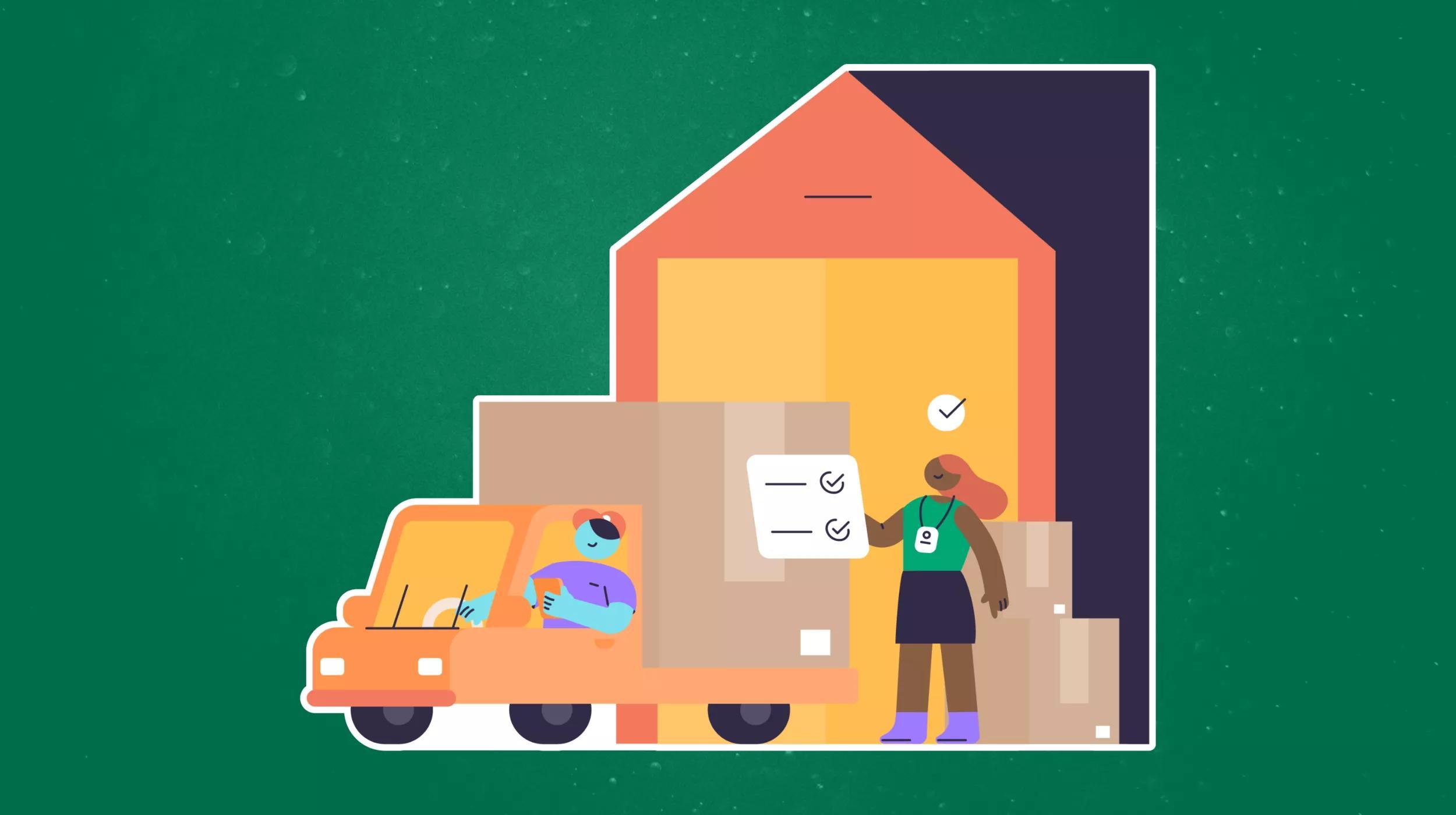
Getting enough user traffic to your website is the first key to having a successful online business. There are countless guides, SEO tips, and pay-per-click strategies to build your website's traffic. What most businesses lack once they gain that traffic, however, is a strategy to convert a significant percentage of their traffic to actual contacts. One thousand daily visitors is a nice ego builder for a small business, but if only one of those visitors ever contacts you, there's something missing in the layout or functionality of your website.
Our real estate business spent years sitting on our laurels as thousands of buyers strolled through our listings every day and we snagged a few lucky clients every month, not understanding that there was so much more business available.
Through some on-page optimization, calls-to-action, and proactive registration requests, we've grown our contacts and leads to 10 times what they originally were, with virtually the same traffic.
Here are five concrete ways you can focus your website's layout and functionality to squeeze those extra contacts and leads out of your current traffic:
Ask for the digits.
You didn't forget that you were in sales, did you? We often get caught up in delivering the best content, being knowledge consultants, and providing experiences. The No. 1 way any salesperson gets sales, though, is asking for them. Try a forced/nag registration function that pops up regularly asking the user to sign up. Don't be afraid of scaring some of your traffic away -- most of your visitors are already leaving without contacting you. Make your contact form prominent, and make sure your phone number is displayed on all pages.
In this age of the supposedly jaded Internet user, more than half of our sign-ups not only give us their email address, they give us a real phone number. All we have to do is ask.
Don't ask for too much.
There's a caveat to every silver bullet. That contact form you're foisting on your visitors has to look like it will take less than 10 seconds to fill out. What do you really need from that person, and what will they reasonably take the time to type into it? Are you asking for their home address? If it's not immediately important for you to be able to snail mail something to them, skip it. You can get it later. Is there a need for an explanation of their situation in a comment form? If so, fine, but if you can simply get their contact info and call back, more visitors will end up submitting the form.
The goal is not to find out everything about a visitor in the first take; it’s to find out just enough about as many visitors as possible to build your database.
Your calls to action need active wording.
"Submit" is the kiss of death for a button's conversion rate. When you have the opportunity to present something of value to your potential customers, make it sound like it's going to be worth their while. "Sign Up!" "Get Your Report Now!" "Start Learning!" Let your users know that they're getting something, not just submitting a report.
In our case, we can approach a real estate buyer in two ways:
"Register for an account. You must be signed in to see the listing details."
or
"Sign up for an account and get emailed when we find more properties that suit your tastes! We'll notify you daily of new listings and price changes."
You see what we did there? Not only did the account sound like an offer of value, we just got them to opt-in to an email drip campaign at the same time as registering.
Keep their eyes on the CTA.
Simply adding calls to action on your website might drive some contacts, but putting them in the right place with the right look will significantly increase their conversion rates. You should tweak page position, color and size to attract the user's eyes back to your CTA whenever possible. Humans are animals. As smart as we'd like to think we are, there are basic things that our brains lead us to whether we like it or not.
Embedding an image in the top-right of your article or post will cause users to read further into your content because the text flow looks easier to follow.
If you want to get your visitors through a particular pitch, shaping your content to visually flow toward a CTA will increase the likelihood that they make it that far. When we reach the end of an article, we naturally want to be told how to capitalize on that knowledge. If you're not telling your users what the next step is with a call to action at the end of every piece of content on your website, you're not capitalizing on that natural moment where users are open to suggestion. Make it bold, make it sound valuable, and make it clear what the user will receive.
Simplify, focus, and streamline the sales pitch.
Don't let your web content get so full of colorful content distractions that they confuse the eye of the customer. We can get caught up in all of the wonderful things we have to offer, but confusing our customers will equal fewer contacts and sales.
Simplify the user's choices.
If they really want a complex set of options, they'll find their way to it, but most people become overloaded when they're offered too many alternatives. What do you really want that user to do most? Figure it out, and strip out the other shiny objects that might direct them away from it.
At the end of the day, your No. 1 goal is to find out who your website visitors are. They might buy today, tomorrow, or a year from now, but without getting their contact information, you have no way to affect that sales cycle once they leave the site. Asking for your website users' contact information in a focused, value-added, simple fashion will allow your business to significantly increase your traffic conversion rates, and sales will naturally follow.